Give the mark room.
Keep at least the width of one monogram letter clear on every side. Never crowd it with copy, rules or partner marks.
School of Skill identity
A practical identity for developing young people through basketball, education and opportunity.
Core identity
Our mark combines a direct SOS monogram with a disciplined wordmark. It should feel established, educational and ready for the court, not decorated for effect.

Keep at least the width of one monogram letter clear on every side. Never crowd it with copy, rules or partner marks.
Use the full lockup no smaller than 150px digital. Below that, use the SOS monogram with an accessible text label.
Use one logo treatment per composition. Preserve its proportions and choose the version with strongest contrast.
Colour
White and navy carry the system. Gold signals action and ambition. Every colour has a job; none is added merely for decoration.
#D4AF37Primary actions, icons and moments of emphasis
#B88A25Small gold text and accessible detail on light ground
#111111Display type and high-priority content
#1B2330Institutional bands, footer and reversed identity
#E6E6E6Rules, borders and quiet separation
#FAFAF8Warm editorial canvas and logo ground
Typography
Bebas Neue gives School of Skill its direct voice. Inter carries detail without getting in the way. Display type earns attention; body type earns trust.
BUILD
YOUR FUTURE.
Skill develops through repetition, good teaching and the confidence to keep moving forward.
Sentence case · readable · humanInterface
Controls are square, direct and easy to recognise. Gold leads. Outlines support. Motion confirms interaction without competing for attention.
Gold line icons. 200ms hover feedback. A visible gold focus ring for keyboard users.
Photography
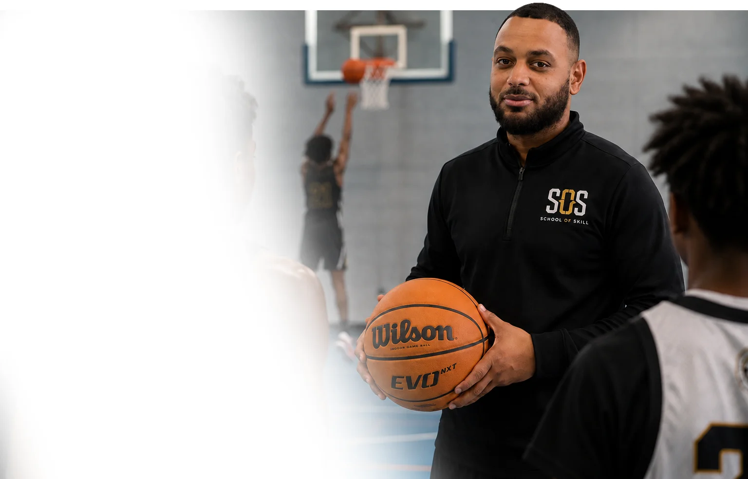
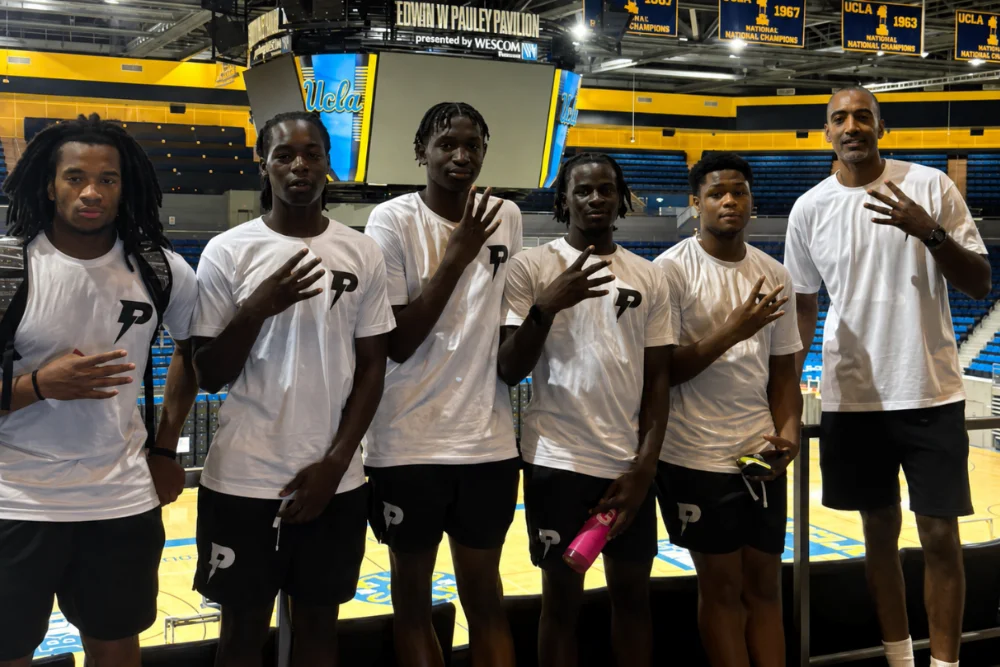
Show the work happening: instruction, effort, teamwork and real environments. Birmingham is the foundation; international opportunity broadens the frame.



Composition
The layout is spacious but never vague. Strong rules, square geometry and a repeatable rhythm make information easier to scan.
Primary reading and interface width, with generous responsive side gutters.
Photography bands, founder stories and compositions that need greater reach.
8 / 16 / 24 / 32 / 48 / 64. Related ideas sit together; new chapters breathe.
Crisp cards, straight rules and restrained motion, never soft SaaS decoration.
Creative guidance
Every design decision should make School of Skill feel more useful, more human and more trustworthy.